trendChart
Description
Use the trendChart to plot a trend analysis chart with specified
x- and y-axes from an adeDataReader
object or a MATLAB® table.
You can plot a trend chart from multiple data sources (such as Cadence® interactive runs) for a single metric.
Creation
Description
Tchart = trendChart(obj,Name=Value)adeDataReader object
obj using the Name-Value pair arguments. Unspecified arguments take
default values.
Note
You must provide the Yaxis argument.
Tchart = trendChart(T,Name=Value)T using the Name-Value pair arguments.
Input Arguments
Name-Value Arguments
Output Arguments
Examples
Unzip the ldo_test_Interactive.244.zip file attached with this example. Load the ldo_test_Interactive.244.mat file containing the adeInfo object data.
unzip('ldo_test_Interactive.244.zip');
data = adeDataReader('ldo_test_Interactive.244.mat');
Find the variables for trend chart analysis.
fields = data.TrendChartFields;
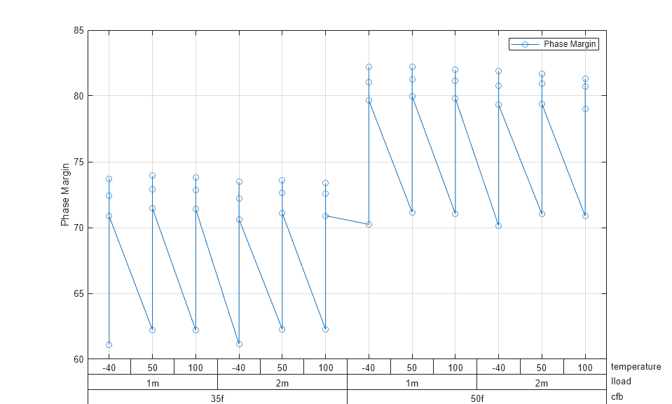
Plot trend chart of Phase Margin against cfb, Iload, and temperature.
fig = trendChart(data,Yaxis='Phase Margin',Xaxis={fields{2},fields{1},fields{4}})
fig =

  trendChart with properties:

           InputFile: [1×1 adeDataReader]
               Xaxis: {'cfb'  'Iload'  'temperature'}
               Yaxis: {'Phase Margin'}
              Legend: {}
             FigAxes: [1×1 Axes]
    TrendChartFields: {12×1 cell}
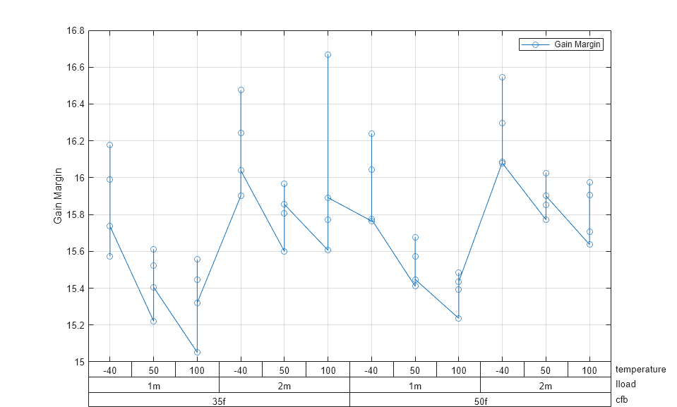
Update the plot to observe the trend of gain margin instead of phase margin against the same variables.
fig.Yaxis = "Gain Margin"
fig =

  trendChart with properties:

           InputFile: [1×1 adeDataReader]
               Xaxis: {'cfb'  'Iload'  'temperature'}
               Yaxis: {'Gain Margin'}
              Legend: {}
             FigAxes: [1×1 Axes]
    TrendChartFields: {12×1 cell}
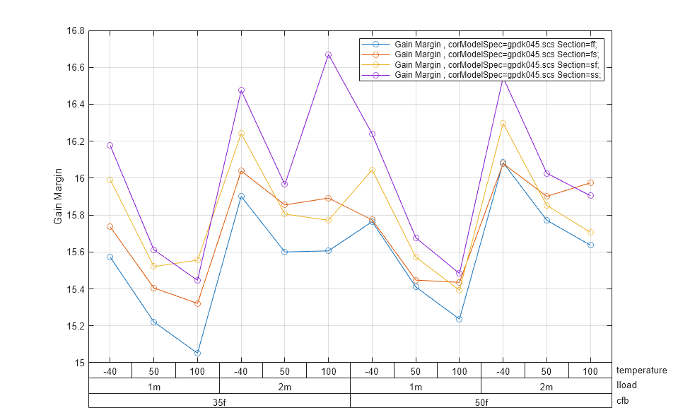
Use the corModelSpec as a legend and update the plot.
fig.Legend = fields{3}
fig =

  trendChart with properties:

           InputFile: [1×1 adeDataReader]
               Xaxis: {'cfb'  'Iload'  'temperature'}
               Yaxis: {'Gain Margin'}
              Legend: {'corModelSpec'}
             FigAxes: [1×1 Axes]
    TrendChartFields: {12×1 cell}
If you accidentally close the plot window, you can bring it back.
fig.show

Create a MATLAB® table T from patient information.
load patients
T = table(Age,Height,Weight,Smoker,...
    Systolic,Diastolic,SelfAssessedHealthStatus)
T =
100×7 table
Age Height Weight Smoker Systolic Diastolic SelfAssessedHealthStatus
___ ______ ______ ______ ________ _________ ________________________
38 71 176 true 124 93 {'Excellent'}
43 69 163 false 109 77 {'Fair' }
38 64 131 false 125 83 {'Good' }
40 67 133 false 117 75 {'Fair' }
49 64 119 false 122 80 {'Good' }
46 68 142 false 121 70 {'Good' }
33 64 142 true 130 88 {'Good' }
40 68 180 false 115 82 {'Good' }
28 68 183 false 115 78 {'Excellent'}
31 66 132 false 118 86 {'Excellent'}
45 68 128 false 114 77 {'Excellent'}
42 66 137 false 115 68 {'Poor' }
25 71 174 false 127 74 {'Poor' }
39 72 202 true 130 95 {'Excellent'}
36 65 129 false 114 79 {'Good' }
48 71 181 true 130 92 {'Good' }
32 69 191 true 124 95 {'Excellent'}
27 69 131 true 123 79 {'Fair' }
37 70 179 false 119 77 {'Good' }
50 68 172 false 125 76 {'Good' }
48 65 133 false 121 75 {'Excellent'}
39 64 117 false 123 79 {'Fair' }
41 62 137 false 114 88 {'Fair' }
44 66 146 true 128 90 {'Fair' }
28 65 123 true 129 96 {'Good' }
25 70 189 false 114 77 {'Poor' }
39 63 143 false 113 80 {'Excellent'}
25 63 114 false 125 76 {'Good' }
36 68 166 false 120 83 {'Poor' }
30 67 186 true 127 89 {'Excellent'}
45 70 126 true 134 92 {'Excellent'}
40 66 137 false 121 83 {'Poor' }
25 64 138 false 115 80 {'Excellent'}
47 70 187 false 127 84 {'Excellent'}
44 71 193 false 121 92 {'Good' }
48 66 137 false 127 83 {'Excellent'}
44 71 192 true 136 90 {'Good' }
35 66 118 false 117 85 {'Fair' }
33 66 180 true 124 90 {'Good' }
38 63 128 false 120 74 {'Good' }
39 71 164 true 128 92 {'Fair' }
44 69 183 false 116 80 {'Excellent'}
44 70 169 true 132 89 {'Good' }
37 70 194 true 137 96 {'Excellent'}
45 67 172 false 117 89 {'Good' }
37 65 135 false 116 77 {'Fair' }
30 68 182 false 119 81 {'Poor' }
39 62 121 false 123 76 {'Good' }
42 70 158 false 116 83 {'Excellent'}
42 67 179 true 124 78 {'Good' }
49 68 170 true 129 95 {'Poor' }
44 62 136 true 130 91 {'Good' }
43 64 135 true 132 91 {'Poor' }
47 66 147 false 117 86 {'Excellent'}
50 72 186 true 129 89 {'Excellent'}
38 63 124 false 118 79 {'Excellent'}
41 66 134 false 120 74 {'Good' }
45 70 170 true 138 82 {'Good' }
36 71 180 false 117 76 {'Good' }
38 68 130 false 113 81 {'Good' }
29 63 130 false 122 77 {'Excellent'}
28 65 127 false 115 73 {'Good' }
30 67 141 false 120 85 {'Excellent'}
28 66 111 false 117 76 {'Good' }
29 68 134 false 123 80 {'Excellent'}
36 71 189 false 123 80 {'Good' }
45 70 137 false 119 79 {'Excellent'}
32 60 136 false 110 82 {'Excellent'}
31 64 130 false 121 79 {'Excellent'}
48 64 137 true 138 82 {'Excellent'}
25 66 186 false 125 75 {'Good' }
40 64 127 true 122 91 {'Fair' }
39 72 176 false 120 74 {'Excellent'}
41 65 127 false 117 78 {'Poor' }
33 67 115 true 125 85 {'Excellent'}
31 72 178 true 124 84 {'Fair' }
35 64 131 false 121 75 {'Fair' }
32 68 183 false 118 78 {'Poor' }
42 66 194 false 120 81 {'Excellent'}
48 64 126 false 118 79 {'Good' }
34 68 186 false 118 85 {'Good' }
39 69 188 false 122 79 {'Excellent'}
28 69 189 true 134 82 {'Good' }
29 64 120 false 131 80 {'Good' }
32 63 132 false 113 80 {'Excellent'}
39 68 182 true 125 92 {'Good' }
37 65 120 true 135 92 {'Poor' }
49 63 123 true 128 96 {'Good' }
31 66 141 true 123 87 {'Good' }
37 65 129 false 122 81 {'Good' }
38 68 184 true 138 90 {'Excellent'}
45 71 181 false 124 77 {'Excellent'}
30 70 124 false 130 91 {'Fair' }
48 71 174 false 123 79 {'Good' }
48 66 134 false 129 73 {'Excellent'}
25 69 171 true 128 99 {'Good' }
44 69 188 true 124 92 {'Good' }
49 70 186 false 119 74 {'Fair' }
45 68 172 true 136 93 {'Good' }
48 66 177 false 114 86 {'Fair' }
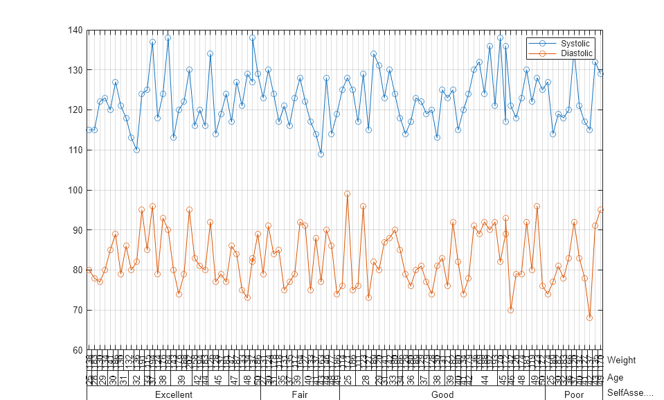
Plot a trend chart from the table. Plot the age, height, and self-assessed health status of the patient along the x-axis and the systolic and diastolic blood pressure along the y-axis.
fig=trendChart(T,Yaxis={'Systolic','Diastolic'},...
    Xaxis={'SelfAssessedHealthStatus','Age','Weight'})
fig =

  trendChart with properties:

           InputFile: [100×7 table]
               Xaxis: {'SelfAssessedHealthStatus'  'Age'  'Weight'}
               Yaxis: {'Systolic'  'Diastolic'}
              Legend: {}
             FigAxes: [1×1 Axes]
    TrendChartFields: {1×7 cell}