Main Content

appdesigner.customcomponent.configureMetadata

Configure custom UI component for use in App Designer

Since R2021a

    Description

    example

    appdesigner.customcomponent.configureMetadata(classfile) opens a dialog to configure App Designer metadata for the UI component class specified by classfile. This metadata enables the component to appear in the App Designer Component Library and be used interactively in the canvas.

    The function generates a folder named resources that contains the metadata. Share this folder when you share your UI component.

    Examples

    collapse all

    Use the App Designer Custom UI Component Metadata dialog to configure an existing UI component class for use in App Designer.

    Assume you created a subclass of the matlab.ui.componentcontainer.ComponentContainer base class and saved the class file as IPAddressComponent.m in the folder C:\MyComponents. Launch a dialog to configure the IPAddressComponent for use in App Designer.

    appdesigner.customcomponent.configureMetadata("C:\MyComponents\IPAddressComponent.m")

    App Designer Custom UI Component Metadata dialog box. The dialog box lists the component file and provides fields for customizing the component metadata. The Component Library Appearance section contains fields for the component name, category, and icon. The Component Details section contains fields for the component description, version, author's name, and author's email. The bottom of the dialog box shows Help, OK, and Cancel buttons.

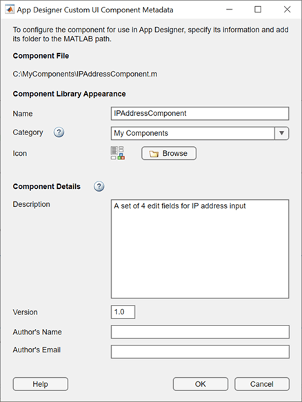
    Fill out the form, then select OK. The function generates a folder named resources with the specified metadata in the C:\MyComponents folder. Add C:\MyComponents to the MATLAB® path and open an app in App Designer to see your component in the Component Library.

    Input Arguments

    collapse all

    Path to the UI component class file, specified as a character vector or string scalar. classfile can be an absolute or relative path.

    Example: 'C:\MyComponents\IPAddressComponent.m'

    Example: "IPAddressComponent.m"

    More About

    collapse all

    Dialog Options

    This table gives a summary of each of the options in the App Designer Custom UI Component Metadata dialog.

    OptionSummary
    NameThe name of the component as it appears in the App Designer Component Library.
    Category The category of the Component Library that the component appears in. Choose an existing category from the drop-down or create a new category by entering a name for it.
    IconThe icon that appears above the component name in the Component Library. Choose a .gif, .jpeg, .jpg, or .png file on your computer.
    DescriptionThe description that the user sees when hovering over the component in the Component Library.
    VersionThe component version, specified as Major.Minor. The default value is 1.0. Increment the number after the decimal point after making minor changes to the component, and increment the number before the decimal point after making major changes.
    Author's NameThe name of the component author that the user sees when hovering over the component in the Component Library.
    Author's EmailThe email address of the component author that the user sees when hovering over the component in the Component Library.

    Version History

    Introduced in R2021a