View Multidimensional Signals Using the Array Plot
This example shows how to view and analyze data using an array plot in the Simulation Data Inspector. You can use an array plot to view multidimensional signals, including variable-size signals, that you log from simulation or import from another source into the Simulation Data Inspector. This example plots and analyzes imported data from a system that:
Samples a signal contaminated with noise using an analog to digital converter.
Performs a discrete Fourier transform (DFT) on the sampled signal.
Removes the noise from the signal in the frequency domain.
Performs an inverse DFT on the filtered signal to return to the time domain.
The signal samples are processed using frames, which buffer several samples into an array. You can use the array plot to view the frames of the time domain signal and to view the frequency domain representation of the signal.
Import Data into Simulation Data Inspector
Open the Simulation Data Inspector.
Simulink.sdi.view
The data for this example is stored in the MAT file NoiseFilteringData.mat. To import the data using the user interface, click Import ![]() .
.
In the Import dialog box, under Import from, select File. Then, enter NoiseFilteringData.mat in the text box and click Import.
Alternatively, import the data programmatically using the Simulink.sdi.Run.create function.
runObj = Simulink.sdi.Run.create("Noise Filtering Data Run","file","NoiseFilteringData.mat");
Plot Data Using Array Plot
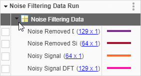
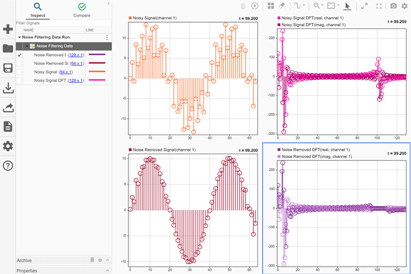
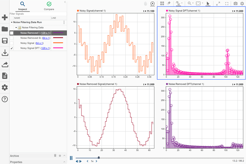
By default, the Simulation Data Inspector groups signals according to data hierarchy, and groups of signals are collapsed. To view the signals that were imported, click the arrow next to Noise Filtering Data. Because the signals contain multidimensional data, the dimensions of each sample are indicated to the right of the signal name.
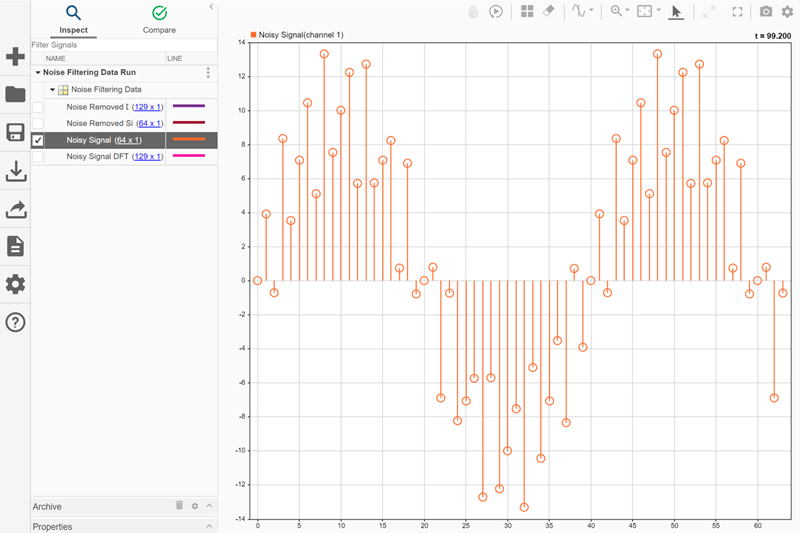
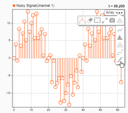
By default, the Simulation Data Inspector uses time plots for all subplots in the layout. Time plots do not support displaying multidimensional data. To plot Noisy Signal, select the check box next to it. A menu appears in the plot area with actions you can perform on the multidimensional signal. To view the signal data, select Change active subplot to array plot and click OK.
Each 64-by-1 sample of Noisy Signal is a frame of time-domain data for a sine wave contaminated by noise. The array plot uses the row index within the sample as the x data and the sample value at that index as the y data.
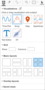
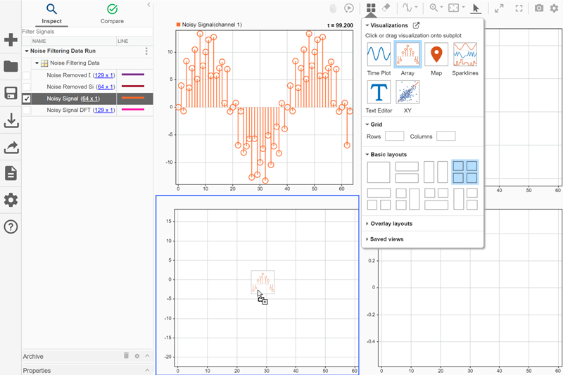
Change the subplot layout to include four subplots so you can plot the other signals. Click Visualizations and layouts ![]() . Then, under Basic Layouts, select the four-subplot layout.
. Then, under Basic Layouts, select the four-subplot layout.
You can plot the other signals the same way as the first:
Select the subplot where you want to plot the signal.
Select the check box next to the signal you want to plot.
Select the option to change the active subplot to an array plot.
Click OK.
You can also manually change the time plots to array plots then plot the signals using the check boxes in the table.
To manually change a time plot to an array plot, click Visualizations and layouts ![]() , then click or drag the Array icon onto a subplot.
, then click or drag the Array icon onto a subplot.
Using either strategy, plot the remaining signals so the time-domain signals are on the left and the frequency-domain data is on the right. In the time domain, you can see the sine wave is smoother after the frequency domain processing. In the frequency domain, you can see the peak that corresponds to the high-frequency noise and its removal.
Modify Array Plot Appearance
Using the array plot settings, you can change the plot type and control the values on the x-axis by specifying an offset and an increment value that defines the space between values on the x-axis. For example, change the settings for the time domain plots to better suit the plotted data.
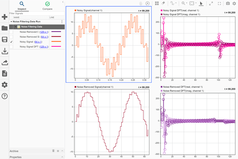
By default, the array plot uses a stem plot type. Because the frequency domain data is discrete, a stem plot is well-suited. The time domain data represents an analog signal that is sampled, which is better represented as a stair plot. You can change the plot type using the subplot menu. To change the Noisy Signal and Noise Removed Signal array plot types to stair:
Pause on the subplot.
Click the three dots that appear.
Expand the Plot Type list and select Stair.
Next, adjust the x-axes for the time domain plots to accurately reflect the relative sample times for each frame. Using the Visualization Settings for the array plot, change the x-axis increment to match the sample rate of 0.005s used to generate the data. First, select the subplot you want to modify, then click Visualization Settings ![]() and specify the X-Axis Increment as
and specify the X-Axis Increment as 0.005.
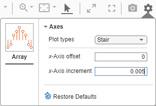
The x-axis labels update to indicate that each frame represents a bit more than 300ms of signal data.
You can also modify the appearance of the array plot by modifying properties on the plotted signal. Using the Properties pane, you can modify:
The signal name, which appears in the legend.
The line style and color.
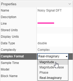
The format used to display complex data.
The frequency domain data is complex. By default, complex data is displayed in real-imaginary format, and the array plot uses different shades of the same color to display the real and imaginary components. You can control how complex data is plotted by changing the Complex Format parameter for the signal. To change the Complex Format for the Noisy Signal DFT and Noise Removed DFT signals to Magnitude:
Select the row for the signal in the table.
Expand the Properties pane.
From the Complex Format list, select
Magnitude.
Analyze Multidimensional Data over Time
The array plot provides a two-dimensional representation of one sample of a multidimensional signal, plotting the values in a column evenly spaced along the x-axis. The signals also have a time component, and the data in each multidimensional sample can vary with time.
When a view contains visualizations that support cursors, the array plot synchronizes with the cursor to display the sample that corresponds to the cursor position in time. You can also use the replay controls to analyze the sample values on an array plot over time.
The array plot indicates the time that corresponds to the plotted sample in the upper-right of the plot. By default, the array plot displays the last sample of data. When you enable the replay controls, the array plots update to display the sample value for the first time point. To show the replay controls, click Show/hide replay controls ![]() .
.
You can manually control which sample is displayed on the plots using the Step forward ![]() and Step backward
and Step backward ![]() buttons or by dragging the progress indicator
buttons or by dragging the progress indicator ![]() . To replay the data, click Replay
. To replay the data, click Replay ![]() .
.
The replay sweeps through the sample values at a rate you can adjust using the Decrease replay speed ![]() and Increase replay speed
and Increase replay speed ![]() buttons on either side of the replay speed or specify by clicking the replay speed
buttons on either side of the replay speed or specify by clicking the replay speed ![]() and entering a new value. By default, the replay updates plots at a rate of one second per second, meaning that the cursor moves through one second of data in one second of clock time.
and entering a new value. By default, the replay updates plots at a rate of one second per second, meaning that the cursor moves through one second of data in one second of clock time.
As the plots update, you can see how the sine wave shifts within each frame and how that affects the results of the DFT.