Visualize and Assess Classifier Performance in Classification Learner
After training classifiers in the Classification Learner app, you can compare models based on accuracy values, visualize results by plotting class predictions, and assess performance using the confusion matrix, ROC curve, and precision-recall curve.
If you use k-fold cross-validation, the app computes the model metrics (such as error rate) using the combined set of observations in the k validation folds, and reports the average values. The app makes predictions on the observations in the validation folds, and displays the predictions in the plots.
When you import data into the app, the app automatically uses cross-validation by default. To select a different validation scheme, see Select Validation Scheme in Classification Learner or Regression Learner.
If you use holdout validation, the app makes predictions and computes model metrics using the observations in the validation set. The app also computes the confusion matrix, ROC curve, and precision-recall curve based on the predictions.
If you use resubstitution validation, the app makes predictions and computes model metrics using the same training data set used to train the full model.
Check Performance in the Models Pane
After training a model in Classification Learner, check the Models pane to see which model has the best overall accuracy in percent. The best Accuracy (Validation) score is highlighted in a box. This score is the validation accuracy. The validation accuracy score estimates a model's performance on new data compared to the training data. Use the score to help you choose the best model.

The best overall score might not be the best model for your goal. A model with a slightly lower overall accuracy might be the best classifier for your goal. For example, false positives in a particular class might be important to you. You might want to exclude some predictors where data collection is expensive or difficult.
To find out how the classifier performed in each class, examine the confusion matrix.
View Model Metrics in Summary Tab and Models Pane
You can view model metrics in the model Summary tab and the Models pane, and use the metrics to assess and compare models. Alternatively, you can use the compare results plot and the Results Table tab to compare models. For more information, see View Model Information and Results in Compare Results Plot and Compare Model Information and Results in Table View.
The Training Results and Additional Training Results metrics are calculated on the validation set. The Test Results and Additional Test Results metrics, if displayed, are calculated on a test data set. For more information, see Evaluate Model Performance Using Test Data Set.

Model Metrics
| Metric | Description | Tip |
|---|---|---|
| Accuracy | Percentage of observations that are correctly classified | Look for larger accuracy values. |
| Total cost | Total misclassification cost. By default, the total misclassification cost is the number of misclassified observations. For more information, see Misclassification Costs in Classification Learner App. | Look for smaller total cost values. Make sure the accuracy value is still large. |
| Error rate | Percentage of observations that are misclassified. The error rate is 1 minus the accuracy. | Look for smaller error rate values. |
| Prediction speed | Estimated prediction speed for new data, based on the prediction times for the validation data sets | Background processes inside and outside the app can affect this estimate, so train models under similar conditions for better comparisons. |
| Training time | Time spent training the model | Background processes inside and outside the app can affect this estimate, so train models under similar conditions for better comparisons. |
| Model size (Compact) | Size of the machine learning model object if exported as a
compact model (that is, without training data). When you export a
model to the workspace, the exported structure contains the model
object and additional fields. The app displays the size of the model
object (in bytes) as returned by the whos function. Note
that the learnersize function might return a different size
for some model types, because it calls gather on the model
object before calling whos. | Look for model size values that fit the memory requirements of target applications. |
| Model size (Coder) | Approximate size of the model (in bytes) in C/C++ code generated
by MATLAB®
Coder™. The app displays the size (in bytes) returned by the
learnersize function with
type="coder". The coder model size is
NaN for model types that are not supported
for code generation. | For a list of supported model types, see Export Classification Model to MATLAB Coder to Generate C/C++ Code. |
The app provides three additional model metrics: precision, recall, and F1 score. The metrics are indicators of how frequently a model makes correct predictions (true positives and true negatives) and incorrect predictions (false positives and false negatives) for validation or test data with known classes. The metrics are available on a per-class basis, or averaged over all classes using one of these types of average: macro, micro, or weighted. For examples of plots that use these metrics, see Check ROC Curve and Check Precision-Recall Curve.
Additional Model Metrics
| Metric | Description | Tip |
|---|---|---|
| Precision | Positive predictive value, meaning the fraction of predicted true positive results among all predicted positive results | Look for higher precision values. A larger number of false positive predictions lowers the precision of a model. |
| Recall | True positive rate (sensitivity), meaning the fraction of predicted true positive results among all actual true positive results | Look for higher recall values. A larger number of false negative predictions lowers the recall of a model. |
| F1 score | Harmonic mean of precision and recall | To have a high F1 score, a model must have both high precision and high recall. |
Types of Average
| Metric | Description | Tip |
|---|---|---|
| Macro average | Nonweighted average of the per-class metric values | Use this statistic to evaluate how the model performs on average across all classes, regardless of the class frequency. |
| Micro average | Average of the specific metric that is calculated using the combined predicted and actual values for all classes | Use this statistic to evaluate all predictions equally, regardless of class. |
| Weighted average | Average of the per-class metric values, weighted by the occurrence frequency of each class | Use this statistic to evaluate model performance and take into account a large imbalance in class frequency. |
You can sort models in the Models pane according to accuracy, total cost, error rate, macro average precision, macro average recall, or macro average F1 score. To select a metric for model sorting, use the Sort by list at the top of the Models pane. Not all metrics are available for sorting in the Models pane. You can sort models by other metrics in the Results Table (see Compare Model Information and Results in Table View).
You can also delete models listed in the Models pane. Select the model you want to delete and click the Delete selected model button in the upper right of the pane, or right-click the model and select Delete. You cannot delete the last remaining model in the Models pane.
Compare Model Information and Results in Table View
Rather than using the Summary tab or the Models pane to compare model metrics, you can use a table of results. On the Learn tab, in the Plots and Results section, click Results Table. In the Results Table tab, you can sort models by their training and test results, as well as by their options (such as model type, selected features, PCA, and so on). For example, to sort models by validation accuracy, click the sorting arrows in the Accuracy (Validation) column header. A down arrow indicates that models are sorted from highest accuracy to lowest accuracy.
To view more table column options, click the "Select columns to display" button
![]() at the top right of the table. In the Select
Columns to Display dialog box, check the boxes for the columns you want to display
in the results table. Newly selected columns are appended to the table on the right.
at the top right of the table. In the Select
Columns to Display dialog box, check the boxes for the columns you want to display
in the results table. Newly selected columns are appended to the table on the right.

Within the results table, you can manually drag table columns so that they appear in your preferred order.
You can mark some models as favorites by using the Favorite column. The app keeps the selection of favorite models consistent between the results table and the Models pane. Unlike other columns, the Favorite and Model Number columns cannot be removed from the table.
To remove a row from the table, right-click any entry within the row and click Hide row (or Hide selected row(s) if the row is highlighted). To remove consecutive rows, click any entry within the first row you want to remove, press Shift, and click any entry within the last row you want to remove. Then, right-click one of the highlighted entries and click Hide selected row(s). To restore all removed rows, right-click any entry in the table and click Show all rows. The restored rows are appended to the bottom of the table.
To export the information in the table, use one of the export buttons
![]() at the top right of the table. Choose between
exporting the table to the workspace or to a file. The exported table includes only
the displayed rows and columns.
at the top right of the table. Choose between
exporting the table to the workspace or to a file. The exported table includes only
the displayed rows and columns.
View Model Information and Results in Compare Results Plot
You can view model information and results in a compare results plot. On the Learn or Test tab, in the Plots and Results section, click Compare Results. Alternatively, click the Plot Results button in the Results Table tab. The plot shows a bar chart of validation accuracy for the models, ordered from highest to lowest accuracy value. You can sort the models by other training and test results using the Sort by list under Sort Data. To group models of the same type, select Group by model type. To assign the same color to all model types, clear Color by model type.

Select model types to display using the check boxes under Select. Hide a displayed model by right-clicking a bar in the plot and selecting Hide Model.
You can also select and filter the displayed models by clicking the Filter button under Filter and Group. In the Filter and Select Models dialog box, click Select Metrics and select the metrics to display in the table of models at the top of the dialog box. Within the table, you can drag the table columns so that they appear in your preferred order. Click the sorting arrows in the table headers to sort the table. To filter models by metric value, first select a metric in the Filter by column. Then select a condition in the Filter Models table, enter a value in the Value field, and click Apply Filter(s). The app updates the selections in the table of models. You can specify additional conditions by clicking the Add Filter button. Click OK to display the updated plot.

Select other metrics to plot in the X and
Y lists under Plot Data. If you do not
select Model Number for X or
Y, the app displays a scatter plot.

To export a Compare Results plot to a figure, see Export Plots in Classification Learner App.
To export the results table to the workspace, click Export Plot and select Export Plot Data. In the Export Result Metrics Plot Data dialog box, edit the name of the exported variable, if necessary, and click OK. The app creates a structure array that contains the results table.
Plot Classifier Results
Use a scatter plot to examine the classifier results. To view the scatter plot for a model, select the model in the Models pane. On the Learn tab, in the Plots and Results section, click the arrow to open the gallery, and then click Scatter in the Validation Results group. After you train a classifier, the scatter plot switches from displaying the data to showing model predictions. If you are using holdout or cross-validation, then these predictions are the predictions on the held-out (validation) observations. In other words, the software obtains each prediction by using a model that was trained without the corresponding observation.
To investigate your results, use the controls on the right. You can:
Choose whether to plot model predictions or the data alone.
Show or hide correct or incorrect results using the check boxes under Model predictions.
Choose features to plot using the X and Y lists under Predictors.
Visualize results by class by showing or hiding specific classes using the check boxes under Show.
Change the stacking order of the plotted classes by selecting a class under Classes and then clicking Move to Front.
Zoom in and out, or pan across the plot. To enable zooming or panning, place the mouse over the scatter plot and click the corresponding button on the toolbar that appears above the top right of the plot.

See also Investigate Features in the Scatter Plot.
To export the scatter plots you create in the app to figures, see Export Plots in Classification Learner App.
Check Performance Per Class in the Confusion Matrix
Use the confusion matrix plot to understand how the currently selected classifier performed in each class. After you train a classification model, the app automatically opens the confusion matrix for that model. If you train an "All" model, the app opens the confusion matrix for the first model only. To view the confusion matrix for another model, select the model in the Models pane. On the Learn tab, in the Plots and Results section, click the arrow to open the gallery, and then click Confusion Matrix (Validation) in the Validation Results group. The confusion matrix helps you identify the areas where the classifier performed poorly.
When you open the plot, the rows show the true class, and the columns show the predicted class. If you are using holdout or cross-validation, then the confusion matrix is calculated using the predictions on the held-out (validation) observations. The diagonal cells show where the true class and predicted class match. If these diagonal cells are blue, the classifier has classified observations of this true class correctly.
The default view shows the number of observations in each cell.
To see how the classifier performed per class, under Plot, select the True Positive Rates (TPR), False Negative Rates (FNR) option. The TPR is the proportion of correctly classified observations per true class. The FNR is the proportion of incorrectly classified observations per true class. The plot shows summaries per true class in the last two columns on the right.
Tip
Look for areas where the classifier performed poorly by examining cells off the diagonal that display high percentages and are orange. The higher the percentage, the darker the hue of the cell color. In these orange cells, the true class and the predicted class do not match. The data points are misclassified.

In this example, which uses the carbig data set, the fifth row
from the top shows all cars with the true class Japan. The columns show the
predicted classes. Of the cars from Japan, 77.2% are correctly classified, so
77.2% is the true positive rate for correctly classified
points in this class, shown in the blue cell in the TPR
column.
The other cars in the Japan row are misclassified: 5.1% of the cars are incorrectly classified as from Germany, 5.1% are classified as from Sweden, and 12.7% are classified as from the USA. The false negative rate for incorrectly classified points in this class is 22.8%, shown in the orange cell in the FNR column.
If you want to see numbers of observations (cars, in this example) instead of percentages, under Plot, select Number of observations.
If false positives are important in your classification problem, plot results per predicted class (instead of true class) to investigate false discovery rates. To see results per predicted class, under Plot, select the Positive Predictive Values (PPV), False Discovery Rates (FDR) option. The PPV is the proportion of correctly classified observations per predicted class. The FDR is the proportion of incorrectly classified observations per predicted class. With this option selected, the confusion matrix now includes summary rows below the table. Positive predictive values are shown in blue for the correctly predicted points in each class, and false discovery rates are shown in orange for the incorrectly predicted points in each class.
If you decide there are too many misclassified points in the classes of interest, try changing classifier settings or feature selection to search for a better model.
To export the confusion matrix plots you create in the app to figures, see Export Plots in Classification Learner App.
To export the confusion matrix to the workspace, click Export Plot and select Export Plot Data. In the Export Confusion Matrix Plot Data dialog box, edit the name of the exported variable, if necessary, and click OK. The app creates a structure array that contains the confusion matrix and the class labels.
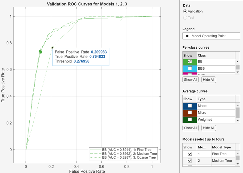
Check ROC Curve
View a receiver operating characteristic (ROC) curve after training a model. In
the Plots and Results section, click the arrow to open the
gallery, and then click ROC Curve (Validation) in the
Validation Results group. The app creates a ROC curve by
using the rocmetrics function.

The ROC curve shows the true positive rate (TPR) versus the false positive rate (FPR) for different thresholds of classification scores, computed by the currently selected classifier. The Model Operating Point shows the false positive rate and true positive rate corresponding to the threshold used by the classifier to classify an observation. For example, a false positive rate of 0.1 indicates that the classifier incorrectly assigns 10% of the negative class observations to the positive class. A true positive rate of 0.85 indicates that the classifier correctly assigns 85% of the positive class observations to the positive class.
The AUC (area under curve) value corresponds to the integral
of a ROC curve (TPR values) with respect to FPR from FPR = 0 to FPR = 1. The AUC value is a measure of the overall quality of the
classifier. The AUC values are in the range 0 to
1, and larger AUC values indicate better classifier
performance. Compare classes and trained models to see if they perform differently
in the ROC curve.
You can create a ROC curve for a specific class using the Show check boxes under Per-Class Curves. However, you do not need to examine ROC curves for both classes in a binary classification problem. The two ROC curves are symmetric, and the AUC values are identical. A TPR of one class is a true negative rate (TNR) of the other class, and TNR is 1 – FPR. Therefore, a plot of TPR versus FPR for one class is the same as a plot of 1 – FPR versus 1 – TPR for the other class.
For a multiclass classifier, the app formulates a set of one-versus-all binary classification problems to have one binary problem for each class, and finds a ROC curve for each class using the corresponding binary problem. Each binary problem assumes that one class is positive and the rest are negative. The model operating point on the plot shows the performance of the classifier for each class in its one-versus-all binary problem.

You can also plot average ROC curves using the Show check boxes under Average Curves. For a description of the types of average, see View Model Metrics in Summary Tab and Models Pane.
You can display the ROC curves of up to four trained models on the same plot by creating a Compare ROC Curves plot. In the Plots and Results section, click the arrow to open the gallery, and then click Compare ROC Curves in the Compare Model Results group. Select models to display under Models to the right of the plot. Each model you select has a different line style in the plot.
For more information about ROC curves, see rocmetrics and ROC Curve and Performance Metrics.
To export the ROC curve plots you create in the app to figures, see Export Plots in Classification Learner App.
To export the ROC curve results to the workspace, click Export
Plot and select Export Plot Data. In the Export
ROC Curve Plot Data dialog box, edit the name of the exported variable, if
necessary, and click OK. The app creates a structure array
that contains the rocmetrics object.
Check Precision-Recall Curve
View a precision-recall curve after training a model. In the Plots and
Results section, click the arrow to open the gallery, and then click
Precision-Recall Curve (Validation) in the
Validation Results group. The app creates a
precision-recall curve by using the rocmetrics function.

The precision-recall curve shows the positive predictive value (precision) versus the true positive rate (recall) for different thresholds of classification scores, computed by the currently selected classifier. The Model Operating Point shows the precision and true positive rate (TPR) corresponding to the threshold used by the classifier to classify an observation. For example, a precision of 0.85 indicates that 85% of observations assigned as positive are true positives. A true positive rate of 0.85 indicates that the classifier correctly assigns 85% of the positive class observations to the positive class.
The PR-AUC (area under curve) value is a measure of the
overall quality of the classifier. The PR-AUC values are in the range 0 to 1, and
higher PR-AUC values generally indicate both high precision and high recall (see
auc). Compare
classes and trained models to see if they perform differently in the
precision-recall curve.
You can create a precision-recall curve for a specific class using the Show check boxes under Per-Class Curves. For a multiclass classifier, the app formulates a set of one-versus-all binary classification problems to have one binary problem for each class, and finds a precision-recall curve for each class using the corresponding binary problem. Each binary problem assumes that one class is positive and the rest are negative. The model operating point on the plot shows the performance of the classifier for each class in its one-versus-all binary problem.
You can also plot average precision-recall curves using the Show check boxes under Average Curves. For a description of the types of average, see View Model Metrics in Summary Tab and Models Pane.

To export a precision-recall curve plot to a figure, see Export Plots in Classification Learner App.
To export the precision-recall curve results to the workspace, click
Export Plot and select Export Plot
Data. In the Export Precision Recall Curve Plot Data dialog box, edit
the name of the exported variable, if necessary, and click
OK. The app creates a structure array that contains the
rocmetrics object.
Compare Model Plots by Changing Layout
Visualize the results of models trained in Classification Learner by using the
plot options in the Plots and Results section of the
Learn tab. You can rearrange the layout of the plots to
compare results across multiple models: use the options in the
Layout button, drag plots, or select the options provided
by the Document Actions button ![]() located to the right of the model plot tabs.
located to the right of the model plot tabs.
For example, after training two models in Classification Learner, display a plot for each model and change the plot layout to compare the plots by using one of these procedures:
In the Plots and Results section, click Layout and select Compare models.
Click the second model tab name, and then drag the second model tab to the right.
Click the Document Actions button
 located to the far right of the model plot tabs.
Select the
located to the far right of the model plot tabs.
Select the Tile Alloption and specify a 1-by-2 layout.
Note that you can click the Hide plot options button
![]() at the top right of the plots to make more room
for the plots.
at the top right of the plots to make more room
for the plots.
Evaluate Model Performance Using Test Data Set
After training a model in Classification Learner, you can evaluate the model performance on a test data set in the app. For more information, see Test Trained Models in Classification Learner or Regression Learner.
See Also
Topics
- Start a Classification Learner or Regression Learner Session
- Train Classification Models in Classification Learner App
- Choose Classifier Options in Classification Learner
- Feature Selection and Feature Transformation Using Classification Learner App
- Export Plots in Classification Learner App
- Export Classification Model to Predict New Data
- Train Decision Trees Using Classification Learner App