Progress Plot
The progress plot provides the live feedback on the status of parameter estimation
while using sbiofit, sbiofitmixed, or the Fit Data program in the
SimBiology Model Analyzer app. When you enable this feature, a new figure
opens and shows the fitting quality measures such as log-likelihood and estimated
parameter values for each function iteration. The plot monitors the progress whether you
are running the fit on a local machine or in parallel using remote clusters.
When you estimate parameters, you can specify which estimation method to use
during the fitting. The progress plot is shown for all the estimation methods except for
nlinfit (Statistics and Machine Learning Toolbox). However, the progress plot differs
depending on whether you are using a nonlinear mixed-effects method
(nlmefit or nlmefitsa) or a nonlinear
regression method, such as lsqnonlin.
Progress Plot for Nonlinear Mixed-Effects Methods
The progress plot figure contains a series of subplots. Specifically, the subplots show the values of fixed-effect parameters (theta), the estimates of the variance parameters, that is, the diagonal elements of the covariance matrix of the random effects (Ψ), and the log-likelihood.

Here are some tips for interpreting the plots.
The fitting function tries to maximize the log-likelihood. When the plot begins to display a flat line, this might indicate that maximization is complete. Try setting the maximum iterations to a lower number to reduce the number of iterations you need and improve performance.
Plots for the fixed effects (
thetas) and the variance parameters (Ψs) should show convergence. If you see oscillations, or jumps without accompanying improvements in the log-likelihood, the model may be overparameterized. Try the following:Reduce the number of fixed effects.
Reduce the number of random effects.
Simplify the covariance matrix pattern of random effects (if you have previously changed it from the default diagonal matrix).
Progress Plot for Nonlinear Regression Methods
The progress plot figure shows a series of subplots, and there are two categories of plots: quality measure plots and estimated parameter plots. For a pooled fit, that is, estimating one set of parameter values for all groups (or individuals), there is only one line for each plot and the line is faded when the fit is finished. For an unpooled fit, that is, estimating one set of parameter values for each group (or individual), each line represents a single individual or group. You can select one or more lines by clicking and dragging the mouse cursor to create a rectangle on any plot. All lines that intersect the rectangle are selected and highlighted across all plots.
You can terminate the fitting at any time by selecting Stop, and partial results are returned. Specifically, for a pooled fit, the result up to the last function iteration is returned. For an unpooled fit, results for any groups that have finished running are returned. The groups currently running are interrupted and partial results from the last iteration are also returned.
Quality Measure Plots
The quality measure plots include the log-likelihood, first-order optimality, and termination condition plots. They occupy the first row of the figure.
Log-likelihood. The estimation method tries to maximize the log-likelihood, and the plot shows the log-likelihood value for each function iteration. When the plot begins to display a flat line, it often indicates that maximization is complete. Try setting the maximum iterations to a lower number to reduce the number of iterations you need and improve performance.
For a pooled fit, there is only one line in the plot and the line is faded when the fit finishes. The log-likelihood plot shows whether the fit converges or fails along with the information on the estimation method termination condition. The next figure is an example of the log-likelihood plot of a pooled fit.

First-order Optimality. First-order optimality is a measure of how close a point x is to optimal,
and the plot is shown when you are using the Optimization Toolbox™ methods (lsqnonlin,
lsqcurvefit, fminunc, and
fmincon). The first-order optimality measure must
be zero at a minimum, but a point with first-order optimality equal to zero
is not necessarily a minimum. For details, see First-order optimality (Optimization Toolbox).
Termination Condition. For a pooled fit, the termination condition is displayed together with the
log-likelihood plot. For details about the termination condition, refer to
the exitflag output argument description of the
corresponding estimation method. Suppose that you are using the lsqnonlin (Optimization Toolbox) method and see a
message: The fit converged with criterion Residual. By
checking the exitflag conditions of the lsqnonlin (Optimization Toolbox) with the keyword
Residual, this termination condition corresponds to
the exitflag value of 3, that is,
change in the residual was less than the specified tolerance.
For an unpooled fit, the Termination Conditions plot contains the summary (histogram) of termination criteria for all groups (or individuals) as shown in the next figure. The y-axis represents the total number of fits for each termination condition, and the x-axis displays all the termination criteria.

Hybrid Functions. If you are performing a hybrid optimization by first running a global
solver, such as ga (Global Optimization Toolbox) or particleswarm (Global Optimization Toolbox), followed by a hybrid
function, the ProgressPlot also shows the quality measure
plots for the hybrid function in the second row. The following figure is an
example where the global optimization algorithm is ga (Global Optimization Toolbox) and the hybrid function is
fminunc (Optimization Toolbox). For an illustrated
example, see Parameter Estimation with Hybrid Solvers.

Estimated Parameter Plot
This plot displays the value of the estimated parameter versus iteration for each group. One estimated parameter plot is displayed for each parameter. The plots start on the second row of the figure and can span multiple rows. Each plot displays a horizontal dashed line for any lower or upper bound you specify for the estimated parameter. The bound lines show only if the range of the plot can include the lines.
For an unpooled fit, the Progress Plot also displays a histogram that shows the distribution of the parameter values for the completed runs. Use the toggle button over the y-axis for each plot to switch between the log and linear scale. The next figure shows an example of an estimated parameter plot with the bound information and distribution of estimated values.

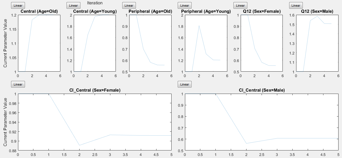
If you have a hierarchical model and are estimating parameters for each category such as estimating parameters for males versus females, the Progress Plot displays one plot per estimated parameter for each category. For example, in the next figure, the Central and Peripheral parameters are estimated for the age categories while Q12 and Cl_Central are estimated for the sex categories.
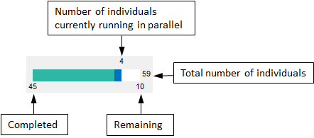
Status Bar
For an unpooled fit running in parallel, the Progress Plot displays a status bar in the bottom right corner. The bar shows information about the remaining and completed number of individuals (or groups) throughout the fit.
See Also
sbiofit | sbiofitmixed | sbiofitstatusplot