Update UIControl Objects and Callbacks
When building a programmatic app in MATLAB®, add UI components to your app using component functions such as
uibutton and uidropdown. The
uicontrol function will continue to be supported. However, there are
benefits to using UI components over UIControl objects. For example, these
are some functionalities that exist only with UI components:
New component types, such as trees, hyperlinks, and instrumentation components
Layout tools to configure your app layout, such as grid layout managers
Additional component customization options, such as component properties that control text alignment and component placeholder text
To take advantage of these benefits, follow these steps to replace
UIControl objects in your app with UI components:
Replace calls to the
uicontrolfunction with calls to the corresponding UI component function.Update properties of the UI component.
Update callbacks of the UI component.
Replace uicontrol Function Calls
The uicontrol function has an argument for specifying the style of
the control. Every UIControl style corresponds to a UI component object
with similar functionality and appearance. In uifigure-based apps,
replace calls to the uicontrol function with the corresponding UI
component function. This table provides a list of the UIControl styles
and the corresponding UI component function.
UIControl Style | UI Component Function | Appearance |
|---|---|---|
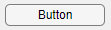
'pushbutton' | uibutton |
|
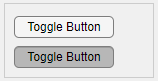
'togglebutton' |
|
|
'checkbox' | uicheckbox |
|
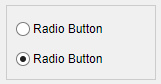
'radiobutton' | uiradiobutton |
|
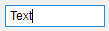
'edit' (single line) | uieditfield |
|
'edit' (multiple lines) | uitextarea |
|
'text' | uilabel |
|
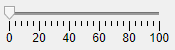
'slider' | uislider |
|
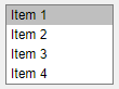
'listbox' | uilistbox |
|
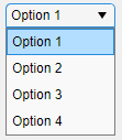
'popupmenu' | uidropdown |
|
'frame' |
|

Some UI components have slightly different configurations and behavior than their
UIControl equivalent. In many cases, you can update your code to adjust
for these differences using the following steps.
Slider Differences
The slider UI component created using uislider has a different
appearance than the slider UIControl object.
If your app uses a UIControl slider to allow users to scroll in a
container, consider removing your code that manages scrolling and using these alternatives instead:
Set the
Scrollableproperty of the container to'on'to enable scrolling.Use the
scrollfunction to scroll within the container programmatically.
Text Input Differences
The 'edit' style UIControl objects align text in
the center by default, whereas uieditfield and
uitextarea UI components align text on the left. You can specify
the text alignment of these UI components by specifying the
HorizontalAlignment property.
If your app uses an 'edit' style UIControl
object to allow users to input numeric values, you can instead create a numeric edit field
using the uieditfield function by specifying the
style argument as
"numeric":
fig = uifigure;
ef = uieditfield(fig,"numeric");
Parent Container Differences
Both the uicontrol function and UI component functions have an
optional first input argument to specify the parent container. If you omit this argument
in the uicontrol function, the function adds the control to the
current figure. If you omit this argument in a UI component function such as
uibutton or uicheckbox, the function creates a
new UI figure and adds the component to that figure.
In uifigure-based apps, create the main app UI figure using the
uifigure function and return the Figure object
as a variable. Then, pass that variable as the first argument to the UI component
functions.
fig = uifigure;
btn = uibutton(fig,"BackgroundColor","blue");
cbx = uicheckbox(fig,"Position",[220 100 84 22]);
For more information, see Update App Figure and Containers.
Update Component Properties
UI component objects and UIControl objects have many of the same
properties. For example, both types of objects have Position,
BackgroundColor, and FontSize properties. You
can use the same code to set these properties for both UIControl objects
and UI components.
However, if you set certain UIControl properties in your app, you
might need to update the names or values of these properties when you transition to using UI
components. This table lists some common properties of UIControl objects
that differ from UI component properties and suggested actions to take if you set these
properties in your code. If you encounter an error related to a property that is not listed
in the table, see the properties page of the specific UI component to resolve the error. For
a list of all UI components and links to their properties, see App Building Components.
UIControl Property | Description | Suggested Actions |
|---|---|---|
String | The |
|
Units | The Units property of a UIControl
object specifies the units of measurement for the object. UI component objects do
not have a Units property. All UI components use pixel units to
measure distances. | Update the Alternatively, if you use normalized units to manage app resize behavior, instead update your app layout to use a grid layout manager. For more information, see Manage App Resize Behavior Programmatically. |
Value | The Value property modifies the status of certain
UIControl objects. For each of these
UIControl styles, the equivalent UI component also has a
Value property. However, the types of property values you
specify might differ. |
|
ForegroundColor | The ForegroundColor property of a
UIControl object specifies the text color for the component. In
UI components, this property is named FontColor. | Replace all references to ForegroundColor with
FontColor. |
Max and Min | The values of the Max and Min
properties have different effects depending on the UIControl
style. UI components have separate properties with more specific names and
behavior. |
|
CData | The CData property specifies an icon or image associated
with a UIControl object. UI components that support icons have an
Icon property instead. In addition, there is an image UI
component for displaying images in an app. |
|
Extent | The Extent property of the UIControl
object stores the size of the object based on its text and font size. UI components
have no equivalent property. | If your app uses the Extent property to specify a
component size based on the text it contains, update your app layout to use a grid
layout manager by using the uigridlayout function. Specify the column width of grid columns that
contain components with text as 'fit', which scales the component
size to fit the text it contains. |
SliderStep | The SliderStep property controls the magnitude of the
slider value change when a user clicks the arrow buttons. There is no equivalent
functionality for a Slider object created using the
uislider function. | Determine if this functionality is critical to your app before updating. There
is no equivalent functionality in uifigure-based apps. |
Update Callbacks
UIControl objects have a Callback property. The
callback function assigned to this property executes in response to a user interaction,
where the interaction depends on the style of the UIControl. For every
UIControl style, the corresponding UI component has an equivalent
callback property, but the property name is specific to the user interaction it corresponds
to. To transition your app code, wherever you assign a callback function to a
Callback property, update the property name to the equivalent
callback property for the UI component. This table lists the callback property names for
each component type.
UIControl Style | Callback User Interaction | Equivalent UI Component Callback |
|---|---|---|
'pushbutton' | The user clicks the button. | ButtonPushedFcn |
'togglebutton' | The user clicks the button. | ButtonPushedFcn |
'checkbox' | The user sets or clears the check box. | SelectionChangedFcn |
'radiobutton' | The user clicks the button. | SelectionChangedFcn of the parent
ButtonGroup container |
'edit' | The user enters text in the edit field. | ValueChangedFcn |
'slider' | The user changes the slider value. | ValueChangedFcn |
'listbox' | The user selects an item. | ValueChangedFcn |
'popupmenu' | The user selects an item. | ValueChangedFcn |
For example, this code creates a button UIControl object that prints
a statement to the MATLAB Command Window when the user pushes the
button.
c = uicontrol;
c.Style = "pushbutton";
c.Callback = @(src,event)disp("Button pushed");
uibutton component and setting the
ButtonPushedFcn callback
property:fig = uifigure;
btn = uibutton(fig)
btn.ButtonPushedFcn = @(src,event)disp("Button pushed");If your app uses a KeyPressFcn callback to respond while a user
types in an 'edit' style UIControl object, instead
consider using the ValueChangingFcn callback when you update your
uicontrol function to uieditfield or
uitextarea. The ValueChangingFcn callback of an
edit field or text area component executes repeatedly as the user types in the
component.
fig = uifigure;
ef = uieditfield(fig);
ef.ValueChangingFcn = @(src,event)disp("Typing...");
Key Press and Button Down Callbacks
All UIControl objects have a ButtonDownFcn
callback to respond when a user clicks on an object, and KeyPressFcn
and KeyReleaseFcn callbacks to respond when a user presses a key when
the object has focus. There is no equivalent callback associated with UI components.
However, you can update your code to have the same behavior by specifying a
WindowButtonDownFcn, WindowKeyPressFcn, or
WindowKeyReleaseFcn callback on the UI figure that contains the
component. You can then query the object that was last clicked by using the
CurrentObject property.
UIControl Callback | UIFigure Callback | Example |
|---|---|---|
ButtonDownFcn | WindowButtonDownFcn |
fig = uifigure;
lb = uilistbox(fig);
fig.WindowButtonDownFcn = {@processClick,lb};

function processClick(src,event,lb)
    if src.CurrentObject == lb
        disp("List box clicked")
    end
end |
KeyPressFcn | WindowKeyPressFcn |
fig = uifigure;
lb = uilistbox(fig);
fig.WindowKeyPressFcn = {@processKeyPress,lb};

function processKeyPress(src,event,lb)
    if src.CurrentObject == lb
        disp("List box key pressed")
    end
end |
KeyReleaseFcn | WindowKeyReleaseFcn |
fig = uifigure;
lb = uilistbox(fig);
fig.WindowKeyReleaseFcn = {@processKeyRelease,lb};

function processKeyRelease(src,event,lb)
    if src.CurrentObject == lb
        disp("List box key released")
    end
end |